A bigger, better Beautiful Web Type
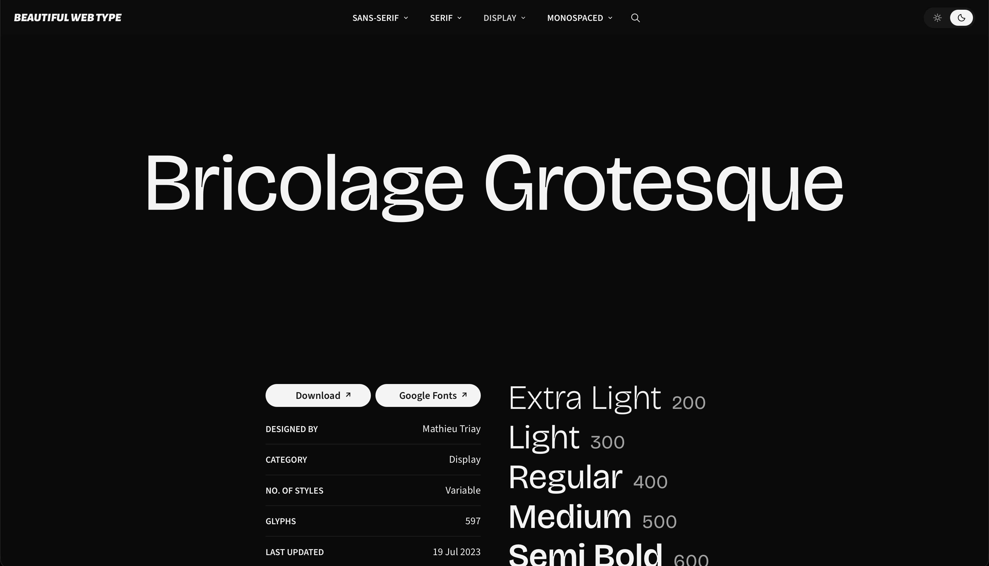
One of my earliest projects is also one of my most popular: Beautiful Web Type.
The original was built over one weekend in 2012, based on my hunch that there were high-quality open-source typefaces in Google Fonts, they just needed to be hunted down amidst the lower-quality ones.
The original version went to the top of Hacker News, got me a private email of praise from a famous type designer, and plenty of recruiting interest from Silicon Valley.
I did a refresh in 2018, but have mainly let it sit untouched since then. But over the weekend I decided to throw some time, love, and tokens at it. The result is a vastly improved site which should help you decide how a typeface actually looks in various settings and whether you’ll actually want to use it.